In many settings, describing some features or trends in a dataset via data ‘verbalisation’ is just as important as data visualisation. I got curious whether Large Language Models can be used to verbalise the types of small datasets that are often encountered in business or consulting reports.
To test this, I generated a few hypothetical datasets and asked ChatGPT 3.5 to describe them. I used hypothetical data rather than real data as exiting data may have been part of the LLM’s training data and I wanted to see how it could handle a novel dataset. The key questions are whether the LLM can ‘understand’ a set of quantitative data enough to write something sensible that describes it, and whether the output is suitable to use in a professional report.
For each of the examples below, I give the prompt that I used and the best out of three responses that I got from ChatGPT (where ‘best’ was subjectively selected by me). Screenshots of the other two responses for each example are also linked if you are curious.
I’ve also made a chart of each of the datasets to make it easier to see what is going on in each one. These charts were not provided to ChatGPT, but typically a human analyst might make charts like these before writing a text description of the data. So maybe this was not an entirely fair test as ChatGPT couldn’t ‘see’ the data. If you have access to ChatGPT Plus (paid), you can upload images which might improve the quality of its responses, but I haven’t tested that.
In early testing I found that ChatGPT can’t reliably do simple calculations like percentage changes or differences accurately from the data provided, so these need to be pre-calculated. I also found that it really wants to invent explanations for patterns that it finds, and I had to adjust the prompt to try to prevent this behaviour and just get it to simply describe the data provided.
Example 1: Simple annual time-series
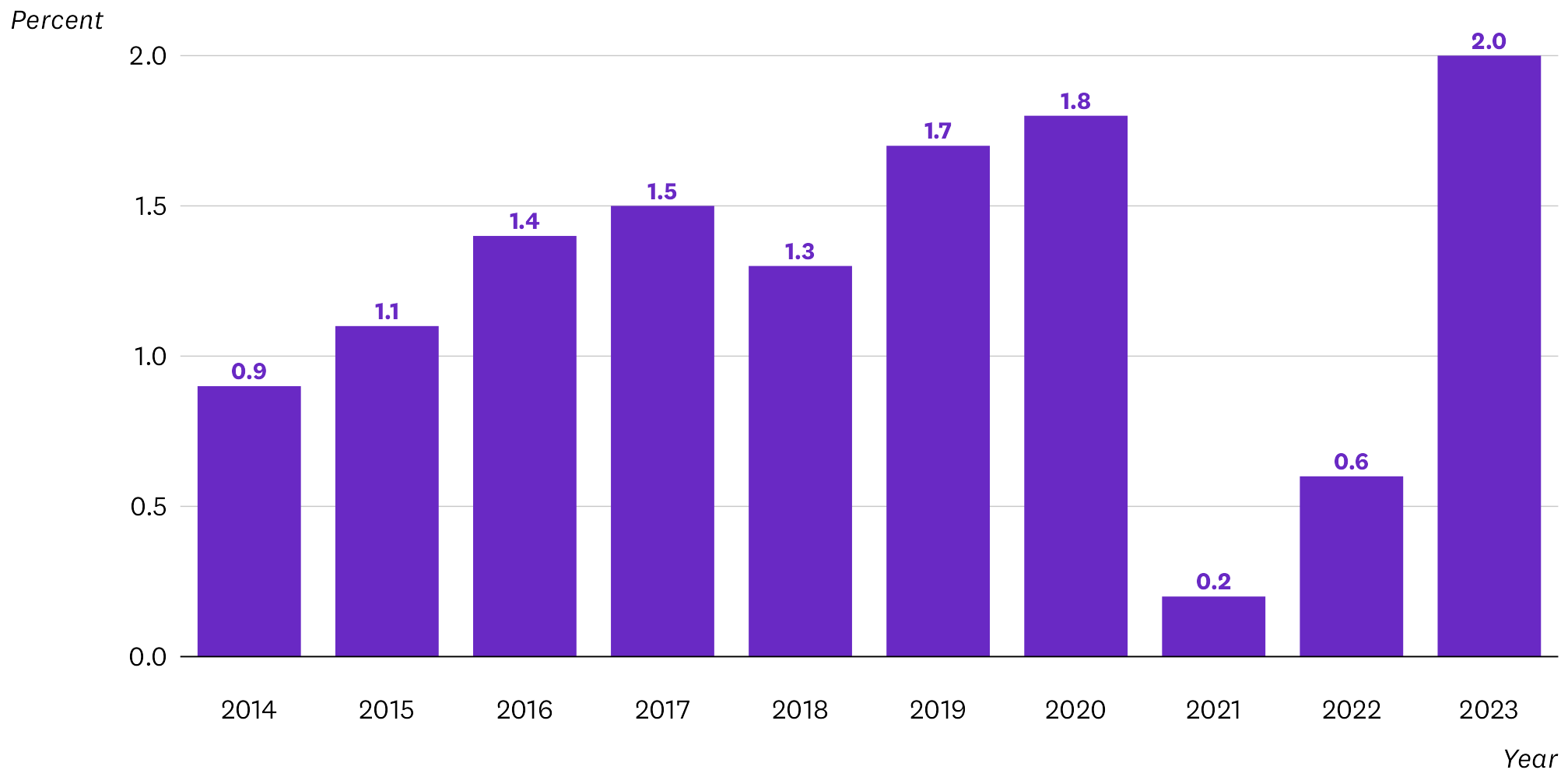
This chart shows annual percentage changes of something over a decade. Here’s the prompt I gave ChatGPT, and its best response:
The following values are the annual rates of growth of sales revenue of a company. Describe the patterns and trends in this data. The description must be based only on the data provided. Do not give explanations for why the observed patterns or trends occurred.
2014: 0.9%
2015: 1.1%
2016: 1.4%
2017: 1.5%
2018: 1.3%
2019: 1.7%
2020: 1.8%
2021: 0.2%
2022: 0.6%
2023: 2.0%
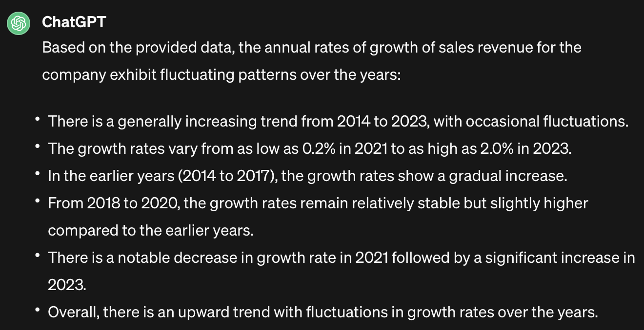
Alternative response 1 | Alternative response 2
This is a reasonably good response, although I would have highlighted the dip in 2018 and the partial recovery in 2022. Some of the bullet points are a bit verbose and dull and need some editing, but overall it is acceptable.
Grade: A-
Example 2: Quarterly time-series with trends and seasonal pattern
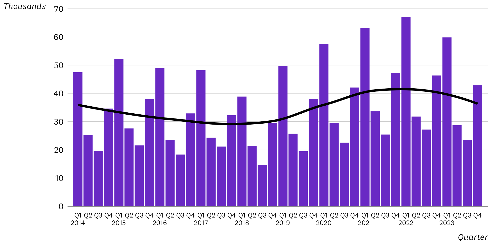
This is a more complex example. I wondered if ChatGPT would pick up the seasonal patterns, and be able to distinguish the underlying trends. Here is the prompt and the best of three responses. The data in the prompt is quite long so I’ve truncated it here.
The following values are the quarterly number of visitors to a theme park. Summarise and describe the key overall patterns and trends in visitor numbers. The description must be based only on the data provided. Do not give explanations for why the observed patterns or trends occurred.
2014Q1: 47486
2014Q2: 25217
2014Q3: 19537
2014Q4: 34600
2015Q1: 52277
2015Q2: 27558
2015Q3: 21564
2015Q4: 37972
…
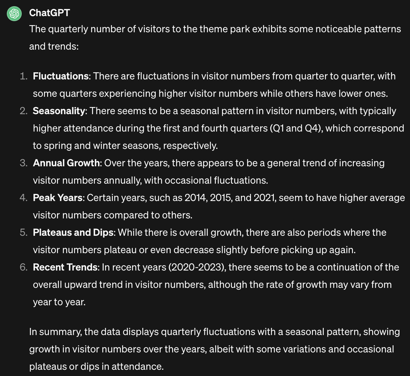
Alternative response 1 | Alternative response 2
While this response does correctly identify the seasonal pattern (which I have to say is very impressive) and the general trends, it’s too abstract to use in a professional report. I would expect a human analyst to focus more on the underlying trend and to describe that more directly, rather than saying things like “plateaus and dips”. Maybe a better prompt would get a better response, but an LLM isn’t going to increase your productivity if you have to spend more time crafting a prompt than it would take to just do the task yourself. It also hasn’t identified the peak years correctly, and the recent trend is not upward.
Grade: C+
Example 3: Non-linear relationship
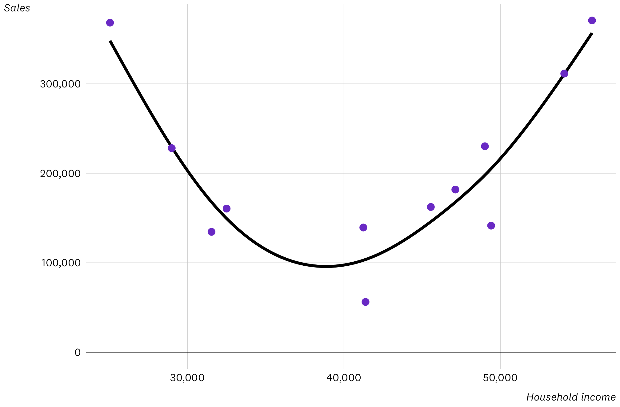
In this final example I moved away from time trends and created a quadratic relationship between two variables. There are only 12 data points, but the U-shape is pretty clear so it shouldn’t be hard to pick up.
The following data shows the average household income in the cities in which a retail business operates and its corresponding sales in those cities. Data is of the form “household income: sales value” for a city on each line. Summarise and describe the relationship between household income and sales in this data. The description must be based only on the data provided. Do not give explanations for the observed relationship.
$55,860: $370,785
$28,996: $228,091
$41,243: $139,381
$32,506: $160,498
$41,384: $56,218
$31,541: $134,514
$49,412: $141,469
$47,124: $181,807
$45,557: $162,351
$25,053: $368,348
$54,086: $311,433
$49,014: $230,176

Alternative response 1 | Alternative response 2
Oh dear. I wondered if it would be better if I sorted the rows by income, but I tested and this didn’t make any difference. Maybe it got thrown by knowing that the data was income and sales, and in its training data higher income usually means higher sales. Or maybe there were just not enough data points for it to pick up the pattern. One of the alternative responses was a lot worse, with it parroting all of the data back.
Grade: F
Conclusion
There’s a lot of promise here, but data verbalisation with LLMs not ready for everyday use yet beyond the simplest datasets such as my annual trend example. If you need to closely read and edit the responses, and maybe tweak the prompts, you’re probably going to spend more time than just writing the text yourself. Let’s come back to this in a year or two and see if things have improved.
