Economic forecasts are often presented as a single scenario which can give a misleading impression of precision. When forecast uncertainty is shown, it is often in the form of high/low forecasts around a central projection. This can confuse people into thinking that these are alternative scenarios, when in fact the variable being forecasted will probably wander around.
This is partly driven by a desire for simplicity – users of forecasts often want a simple set of numbers that they can use for planning purposes. Representing uncertainty visually in a way that people can understand is also difficult.

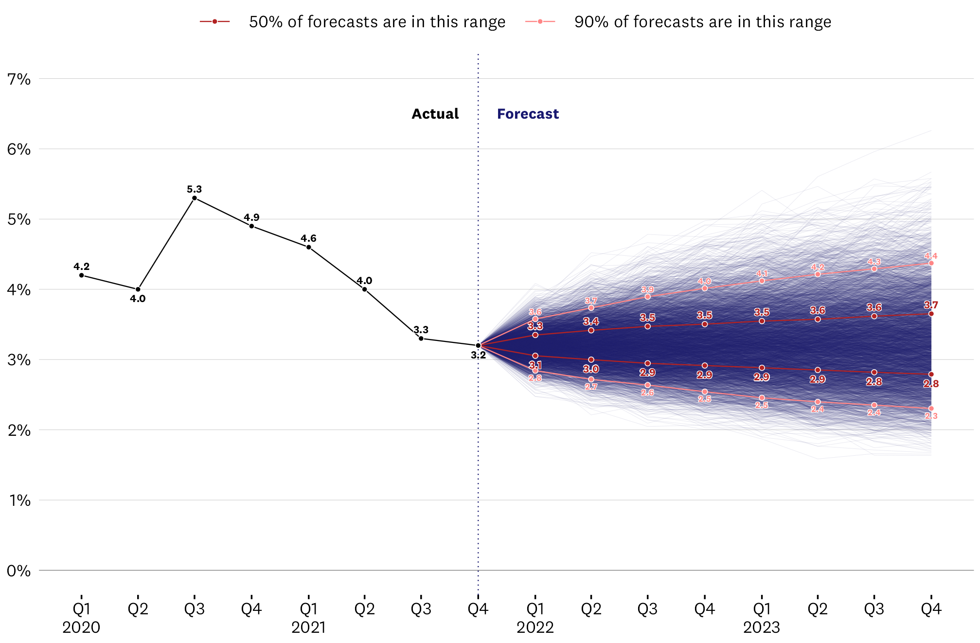
The chart above shows my attempt at visualising the uncertainty associated with a forecast of New Zealand’s quarterly unemployment rate using a simple time-series (ARIMA) model trained on the historic data. Click the chart to see a bigger version.
- Uncertainty of the forecast is represented as 5,000 simulated projections from the model, which are visualised as individual lines with some transparency.
- Where these projections tend to overlap appears darker, thus giving the sense of where the unemployment rate is most likely to be during the forecast period (according to this model).
- Where there is less overlap in the projections, the lines for individual projections can be seen, which indicates to the reader that there are many possible paths that the forecast could take during this period.
The intention is that by showing these scenarios as many individual lines, the reader can get a better sense of the true uncertainty associated with these projections. It’s clear that individual forecast scenarios can wander around a lot within the likely bounds of the forecast, so we can’t be too certain about exactly what the unemployment rate will be in any particular future quarter. However we can see the general direction that forecasts are likely to take over time.
I’ve deliberately not included the mean forecast on this chart, and only indicated the ranges within which the central 50% and 90% of forecast scenarios lie. This is to nudge the reader away from thinking about a single expected forecast and to emphasise the uncertainty. However I did choose to put numbers on those 50% and 90% ranges to make them more concrete.
If all goes according to plan, a reader of this chart will have the impression that future unemployment could take many paths, but is likely to stay within the uncertainty ranges indicated on the chart (assuming the model used to make these forecasts is reasonable).
I made the chart with ggplot2 and there are a few tricks and fiddles to get it to show everything clearly. Have a look at the code if you’d like to learn more.
