Eight years ago, I created some dot density maps of changes over time in New Zealand’s resident population aged between 20 and 34 years old by geographic location. I focussed on this age group because it is around the age when many people first get their own place to live. As such, this group should be very much ‘on the margin’ of the housing market and relatively sensitive to differences in local housing prices and quality (either for renting or buying).
My original map showed changes between the 2001 and 2013 Census years. For Auckland, the most striking thing was the reduction in population of this age group in city-fringe areas like Ponsonby, Grey Lynn, Parnell, etc. Simple maps like this don’t explain why this happened, but it seems plausible that despite being very desirable places to live, housing supply in these areas was restricted in various ways, so housing became unaffordable for many ‘youngish adults’. With the exception of the CBD (thanks to its affordable apartments), people aged 20 to 34 tended to choose to live further from the city centre in 2013 compared to 2001.
With newer data, I’ve recreated these maps below showing population changes over two separate decades: 2001 to 2011 on the left (similar to my original) and 2011 to 2021 on the right. Each blue dot represents a one person increase in resident population over the decade shown, and each red dot is a one person decrease in population. The dots are randomly placed within each SA2 area – I don’t know exactly where people live!
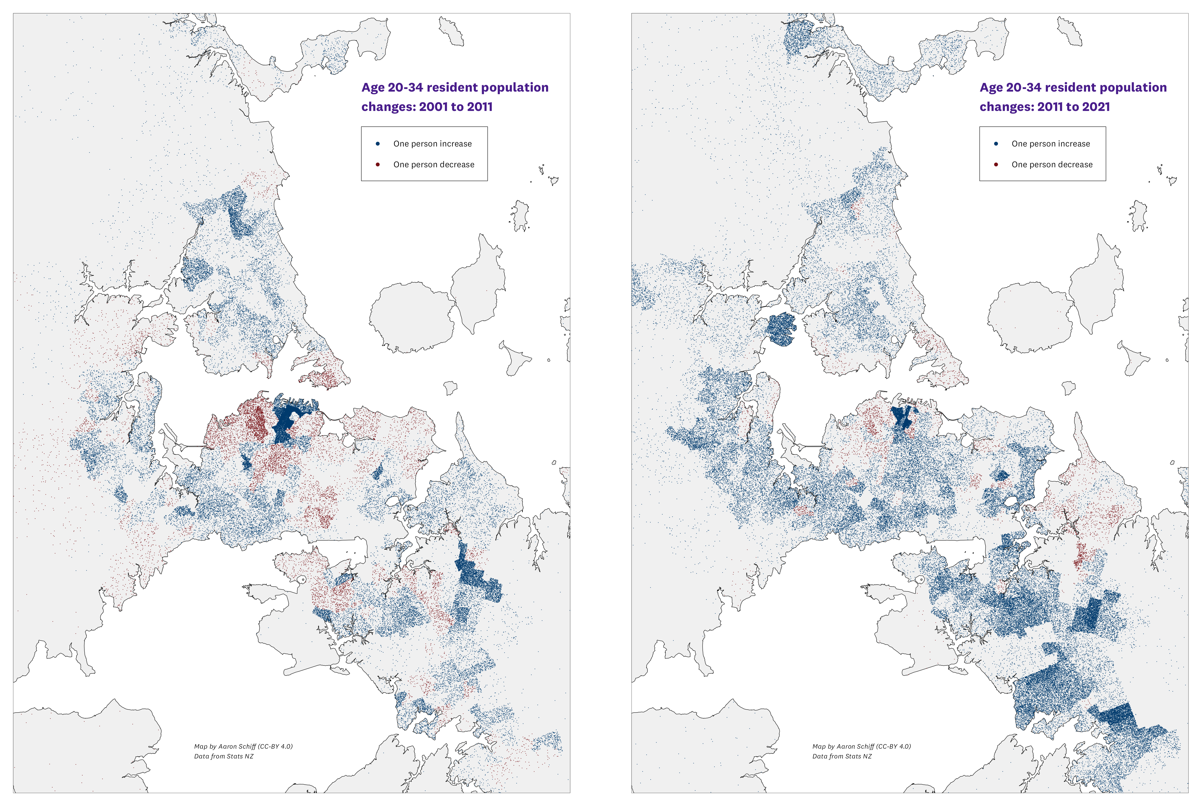
For 2001 to 2011, the dark blue of the CBD with its many affordable apartments is surrounded by red on all sides. Youngish adults moved out of the city-fringe suburbs (and Devonport + Bayswater on the Shore).
For 2011 to 2021, the CBD is still dark blue, but in a smaller area. Some of the areas around the CBD have stayed red, although with fewer dots, possibly because most people aged 20 to 34 have already been priced out of these areas. But some of the areas just to the east and south of the CBD that were red between 2001 and 2011 turned blue between 2011 and 2021. This could reflect Auckland’s Unitary Plan opening up more land for redevelopment in those areas than was previously possible.
We also see a lot of blue in the distant areas south, west, and north of the CBD between 2011 and 2021. Despite Auckland Council’s stated desire for a compact city, many of these ‘youngish adults’ have chosen to live in relatively distant areas over the past decade.
Side notes
-
When I first did this in 2014, I calculated the population changes in Excel and created the maps by hand in QGIS. It was really time-consuming. Since then I’ve learned a few new tricks, and for this update, I did everything in R in a couple of hours. The code and data is on GitHub.
-
Eight years ago, I thought 20 to 34 was a good definition of ‘youngish adults’. Now that I’m eight years older, I think 20 to 39 is a better definition!